Friday, July 29, 2011

Authentique and Pink Persimmon: Paper Pieced Card


Here's a little ditty I put together recently while crafting with some friends. My LSS was one of the first to get in the new Authentique paper lines and I picked up a couple of 6x6 paper pads. The beautiful floral print was perfect for paper piecing the dress on this image from Pink Persimmon. I picked up a couple of their stamp sets recently, and I really love this one!

I stamped the image on Papertrey Ink Stampers Select white cardstock and colored with Copic markers. I then stamped just the dress part of the image using selective inking on the Authentique patterned paper. I trimmed this with my Tonic scissors and an X-acto knife and layered it on the colored image, which I had trimmed out as well. I layered another Authentique patterned paper onto my card base and freehand cut the sentiment banner. Put it all together, and you have a super fun card!

Thanks for stopping by, I hope you enjoyed your visit!


Supplies:

Cardstock: Papertrey Ink (Stampers Select White, Spring Rain

Patterned Paper: Authentique (Splendid 6x6 paper pad)

Stamps: Pink Persimmon (Hello, Vintage Girl) and Lawn Fawn (Just My Type)

Ink: Tsukineko (Memento Tuxedo Black)

Markers: Copic

Wednesday, July 27, 2011

Make It Monday: Coloring with White Ink

This week's Make It Monday technique is coloring with white ink. Heather Nichols from the PTI design team put together a great project for us this week which you can find HERE.

I've been enjoying the new Sweet As Can Be set from their July release, so I broke it out again today. I stamped a double dip ice cream cone on kraft cardstock and used Fresh Snow ink on a bullet point fantastix to color in the ice cream. I fussy cut the cone out and added it to my card. The card base is Harvest Gold cardstock matted with nice, summery patterned paper from
Echo Park's Summer Days 6x6 paper pad. I tied a triple bow ribbon with Hug Snug seam binding and scrunched it with wet fingers until I liked how it looked and added a double stack of buttons with button twine tied in a bow. The cone is adhered with foam tape to give extra dimension. What I really love is that the sentiments in this set allow you to highlight the word "sweet" in a different color if you like, so that's what I did. I tried to take a cue from Nichole Heady in planning my colors. Those of you who were in Summer Card Camp may remember she tries to follow the rule of 3's with color, and I tried to do the same. :) Thanks for the tip, Nichole!

Supplies:
PTI: Sweet As Can Be stamp set; Harvest Gold and Kraft cardstock; True Black, Dark Chocolate, Fresh Snow, and Raspberry Fizz ink; Raspberry Fizz buttons; button twine
Echo Park: Patterned paper
Hug Snug: Seam binding tape

Thanks for stopping by! If you want to head back to Nichole's blog and see more fab entries for this week, click on the link above!

P.S. Fellow Stamp-A-Faire alumni will recognize the suitcase in my photo - I won a fabulous prize at the reception! Thanks, PTI!

Monday, July 25, 2011

Papertrey Ink July 2011 Blog Hop


It's that time of the month again, time to hop around the internet and see all of the fabulous things people are making with PTI products! This month's inspiration picture can be seen below:
I love the pop of life that the orange curtains in the photo create against the otherwise very serene color scheme, so I chose that element to focus on. I also like the pattern in the quilt and rather than use the Mehndi Medallion which was the first thing to come to mind, I pulled out Delightful Doilies to create my background. I stamped the images using True Black ink on Kraft cardstock randomly. I added the happy birthday sentiment from Inside & Out: Birthday stamped onto Stampers Select White cardstock cut with the Fillable Frames #11 die. I tied on a piece of Orange Zest twill ribbon and added the Prima e. line jewels. Finally, this was matted on a Stampers Select White card base. Super simple, yet classy with that great pop of color.

All supplies from Papertrey Ink unless otherwise noted.

Thanks for stopping by, and enjoy the rest of the hop! You can find the other amazing cards by going to Nichole's blog HERE.

Thursday, July 21, 2011

Summer Card Camp '11: Week 4 and PTI Make It Monday: Dry Brushing

It's already the final week of summer card camp. Where did the time go? On Monday, I got a package from Papertrey Ink with my July order (super amazing fast shipping, WTG PTI!) and so it was only logical that I break out my new stamps to work on this week's color combo. And since a new Make It Monday challenge was up at PTI, why not add that to the mix?

I chose the Hanging Out set and some fun paper from Echo Park. I made a mask for the clouds using a piece of cloud patterned paper. It's hard to see in the picture, but I dry brushed white acrylic paint through the mask. After the clouds dried I added the pen outline to give them more definition. I freehand cut the heart from Stampers Select White cardstock and stamped with Polka Dot Basics II and Jenni Bowlin Stick Candy green ink. The dress and overalls were cut from Echo Park patterned paper and stamped. Sentiment is from Fillable Frames #11. Grass is stamped with Jenni Bowlin Seed Packet green ink. You can kind of tell from the picture, but I only adhered the top of the die cuts to the clotes line and bent them slightly forward to make them feel like they are blowing in the breeze. Can I just say that I adore this stamp set? So fun to play with! Black ink is Tsukineko Memento Tuxedo Black.


All supplies by Papertrey Ink unless otherwise noted.


Thanks for stopping by!


Sunday, July 17, 2011

Make It Monday, Take 2

I've had this card idea in my head since I saw the pocket card MIM video. I finally got it out on paper (at the last minute) and I'm really happy with it. So is Madeline, who has claimed it as her own. :) The first thing I thought of for pockets was how it would be very fun to do for kids, making the card into a gift itself. And I loved the idea of crayons, because the colors would make a bright, fun focal point for the card.

Not only did I make a pocket on the outside of the card for the crayons, but I also made a pocket on the inside to hold coloring pages that I stamped on 3.5 x 5 cards. The inside can be finished off with a sentiment appropriate to the occasion.


Paper: PTI Stamper's Select White cardstock, PTI Distressed Dot patterned paper, Echo Park Paper Co. patterned paper.
Ink: Tsukineko Memento Tuxedo Black
Stamps: PTI Out of This World, Happy Trails, Fillable Frames Additions
Ribbon: American Crafts
Dies/Punches: Fiskars Threading Water border punch, PTI Fillable Frames #3 die
Buttons: PTI red and yellow, blue unknown.

Thursday, July 14, 2011

Summer Card Camp '11: Week 3

I'm very happy to say that I'm 3 for 3 so far for Summer Card Camp! I'm very good at signing up for online classes but not so good at following through with doing the "homework". So having a 100% participation "score" makes me smile!

My card for this week is inspired by this week's Make It Monday challenge at Papertrey Ink. You can find more information HERE.

I pulled out some cardstock that I felt matched the color combination this week. Then I saw the pad of Tim Holtz kraft glassine that I had sitting on my desk. I've been wanting to find a way to use it on a project but hadn't taken the leap yet, so I got out one of my bloom builder sets and die cut the small and medium sizes. After assembling the flowers I nested them together and added the Pure Poppy button to the center. I wanted the flower to take center stage on the card, so I kept the rest of the design very simple. I created my pocket using Pure Poppy cardstock and Edgers #1 die set. I then took a scrap of kraft cardstock and cut the accent piece to add to the pocket. I used Scor-Tape to close the sides and die cut a piece of Rustic Cream cardstock for the tag in the pocket. I added some twine, a couple tiny buttons on the tag tie, a sentiment from the Wildflower Garden stamp set, and some Kaisercraft pearls. The card base is Dark Chocolate cardstock, cut to 5 x 5.
I really like how the kraft glassine worked for the flower. It's got a dull sheen to it and adds just enough texture to the card to make it interesting.

All materials from Papertrey Ink unless otherwise noted.

Thanks for stopping by!

Wednesday, July 6, 2011

Summer Card Camp '11: Week 2

It's another week and another color combo for Card Camp with Jennifer & Kristina. I wanted to do something a little different this week so I went rummaging in my embellishment drawer and found an unopened package of Studio Calico wood veneer butterflies. After I discovered there were 5 different sizes of butterflies in there, I went rummaging in my paint drawer and went to work. Add some baker's twine antennae, a sentiment from Papertrey Ink, and a hand drawn frame, and I'm pretty happy with what I came up with!

Supplies: Cardstock (Papertrey Ink), Wood Veneer Butterflies (Studio Calico), Sentiment Stamp (Papertrey Ink: Think Big Favorites #2), Pen (American Crafts), Baker's Twine (The Twinery, Divine Twine), Paint (Kaisercraft, Claudine Hellmuth Studio Line, Little Davis Designs), Jewels (Heidi Swapp for Advantus)

Thanks for stopping by!

Monday, July 4, 2011

Happy 4th and Make It Monday!

Hello, and Happy Independence Day America! Thanks to the holiday, I am off from work today and happily found time for a little ink play this afternoon.

Not only is it Independence Day, but its Make It Monday at Papertrey Ink. This week's technique is multi color stamping with reinkers, brought to us by the uber talented Betsy Veldman. You can find her video tutorial HERE.

The only reinker I have is Simply Chartreuse and unfortunately it doesn't look all that chartreuse when I squirted some out of the bottle, so I took out my handy dandy Tim Holtz Distress Ink reinkers. I chose Peeled Paint, Dried Marigold, Wild Honey, and Spiced Marmalade (Crushed Olive is in the picture, but I didn't end up using it). I tried to make my stamp pad using fun foam like Betsy demonstrates, but apparently all fun foam is not created equally and mine didn't absorb the reinker at all. So I went to plan B.


Plan B was to use Ranger felt ink pad material that I have in my stash, which is made for making your own custom ink pads. I cut a small piece (it comes in an 8.5 x 11 sheet) and went to work. I chose an image from Wildflower Garden and stamped it with Memento Tuxedo Black on the ink pad material. I then added a dot of Spiced Marmalade onto the center of the flower, and for the petals I mixed Wild Honey and Dried Marigold. I inked the stem with Peeled Paint. The pad wicked the ink a bit, but it worked splendidly.


I stamped the wild daisy image across the bottom of a 4.5 x 4.75 piece of kraft cardstock. I then took a Fillable Frames #10 die cut out of my scrap tin. It was Stampers Select White, so I took my Wild Honey ink pad and my ink applicator tool and distressed it. I stamped my wildflower one more time on the die cut and added my sentiment. To the center of each flower I added some dots of Ranger black enamel paint. I finished off by adding a band of Orange Zest twill ribbon and a Harvest Gold button stitched on with button twine. I then matted it on a 5 x 5 Ripe Avocado card base.


And there you have it! Thanks for stopping by.

Sunday, July 3, 2011

Double Duty Card: Summer Card Camp '11 and Make It Monday

I think Card Camp was definitely a good thing for me, I'm inspired and making time for creativity again. Pair camp with Make It Monday challenges at Papertrey Ink, and you've got inspiration overload!

Here's another card that I made that uses the color combo from Card Camp and the reverse polaroid technique from Make It Monday. I masked off the center of my Stampers Select White card base and used the same 4 Twinkling H2O colors from my first Camp card to create the frame. This time, however, I watercolored the whole thing first with the light teal color and then went over it with the pink, purple, and orange colors. After it had a chance to dry, I took my Spring Rain PTI ink spot and colored the center with direct to paper inking. I like how swirling the ink on the paper helped leave light spots for a cloudy effect. I then stamped the paper airplane, trail, and sentiment with Memento Tuxedo Black ink. Just a sweet, simple card.

I can't wait to see what the week 2 color combo will be - I hope I find it as inspiring as the first!

Saturday, July 2, 2011

Fabulously Inky Friday Night

Yesterday after work I headed over to my friend Jenny's house for an evening of fun and crafts. I brought along some of my newest stamp sets from Papertrey Ink to play with and managed to get several cards done.

This first card is my favorite. I used Mehndi Medallion and sentiment from Gracious Vases. I stamped with Memento Tuxedo Black and Jenni Bowlin Cough Syrup (red) inks on kraft cardstock. I think it looks just perfect on the PTI Smokey Shadow card base.

For this card I used the 2010 Anniversary set, Botanical Silhouettes. I used Jenni Bowlin Cough Syrup for the flowers and Candy Stick (green) for the foliage, and PTI Summer Sunrise for the flower centers. Pure Poppy and Lemon Tart cardstock, and some Hero Arts gems finished this one off.

I made this card using the "reverse Polaroid" technique shown by Nichole Heady in this week's Make It Monday video tutorial. I masked off an off center rectangle on kraft cardstock and first used PTI Vintage Cream ink to make the first layer of color for the "frame" and then went over it with my finger which I dipped in Tim Holtz Brushed Corduroy Distress Ink. I stamped the zebra from Its a Jungle Out There using PTI Fresh Snow and Memento Tuxedo Black inks. The sentiment is stamped with PTI Dark Chocolate ink. My card base is Smokey Shadow cardstock, matted with a rectangle of Dotty Biscotti patterned paper. I wrapped button twine along the folded side, and added some e. line pearls to the focal point piece. I'm really happy with how this one turned out.
And speaking of Make It Monday techniques, I really wanted to try this one the week it went up but just didn't find the time. So, I got out the UTEE and tried my hand at faux cracked glass. I used the new Daydreamer stamp set on kraft cardstock and added 3 layers of UTEE. After a while in the freezer, I cracked it and rubbed Brushed Corduroy Distress Ink into the cracks. I used two colors of Distressed Dots patterned paper on a background of Scarlet Jewel cardstock, and again wrapped on some of my beloved button twine. I added two stacked wood buttons that Jenny gave me to finish it off.
And this clean and simple card showcases Gracious Vases. I stamped the dotted lines from Mat Stack 1 Collection as a "ledge" for the vases to sit on. I then added a trio of vases stamped in Terracotta Tile and Summer Sunrise PTI inks with flowers and stems stamped in Orange Zest, Ripe Avocado, and Dark Chocolate. Add the sentiment in True Black and Dark Chocolate and three e. line pearls in graduated sizes and voila!

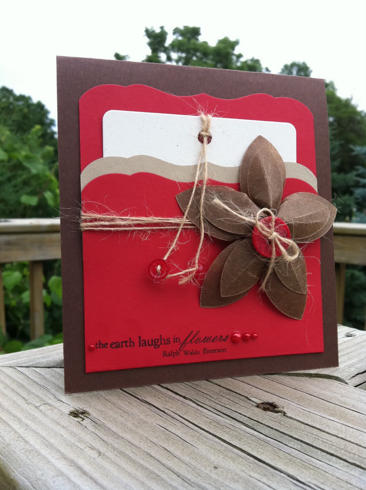
I also made a couple of other cards, which you can see in my Summer Card Camp '11: Week 1 post below. Thanks for stopping by!

Summer Card Camp '11: Week 1


At nearly the last minute, I decided to sign up for Summer Card Class '11 with Jennifer McGuire and Kristina Werner. I'm always so inspired by Jennifer's cards so I was pretty sure I would enjoy the class.


And here is the card I put together. I used Twinkling H2O's (again - I'm in love with them!) to create the background in the colors of the week. Then I used a new favorite Papertrey Ink stamp set, Happy Trails, to add the sentiment, bird, and trail. I finished it off with some button twine from PTI.

Thanks for stopping by!