Thursday, August 25, 2011

Papertrey Ink August 2011 Blog Hop


It's the 25th of the month, and that means Papertrey Ink Blog Hop time! The challenge this month was to use this picture as inspiration for a project:


The thing that caught my eye in this photo was the lovely flowers in the suitcase. I pulled out PTI's Friendship Jar Fillers set and stamped the daisies image a couple of times on Stamper's Select White cardstock. I colored the daisies using my Copics (RV09, RV17, YG23, YG25, YR04, YR07). And then comes the crazy part - I hand cut them out with my Tim Holtz Tonic scissors. My hands aren't very happy with me, but I like the look. I wanted to let the flowers shine, so I added a white mat to my white card base, tying a bow of 1/4" silk ribbon and Rustic Jute button twine to anchor the flowers on the card. I added a sentiment, and there you have it!


Thanks for stopping by! If you want to keep hopping, head to Nichole Heady's blog!


Friday, August 19, 2011

Make It Monday: Glitter Die Borders

Hey there, just flying by with my creation for this week's Make It Monday at Papertrey Ink. This week's technique - use your die as a template for adding a glitter border.

I was having a hard time choosing a die to use for this one, and finally decided that the glitter would be great to highlight some clouds. So out came my Clouds dies, and Fly Away dies and stamp set. My next problem was that I didn't have a glue pen that was working well enough to pull things off, so I went on a trek to Michael's and got both a glue pen and some Martha Stewart fine glitter.

Things were going fabulously, I cut my cardstock to size (PTI Spring Rain and Enchanted Evening base) and die cut my airplane, banner and clouds (PTI Stamper's Select White). I stamped my plane with Barn Red Tim Holtz Distress Ink and used a black Sharpie fine point marker to color in the propeller and cockpit details. Barn Red and PTI True Black were used to stamp out the banner. I traced my cloud dies and glittered everything up, then adhered everything to the card base using various thicknesses of pop up foam.

It was fabulous, my card was done, and I went to put away my supplies. And I sliced my left thumb pad open when I tried to rub some glue residue off of the edges. Ouch. But hey, don't all "true" artists suffer for their art? ;)

Thanks for stopping by, and have a great weekend!


Sunday, August 14, 2011

Moxie Fab Tuesday Trigger: Luminous Layers

This is my first time playing along with Tuesday Trigger at Moxie Fab world, and I had so much fun!

Here is the trigger photo that was to be the inspiration for my card. I loved the idea of the overlapping layers of "mismatched" patterns that magically work together. And here's my interpretation.


I pulled out my Authentique Paper 6x6 pad from the Splendid line and punched out several 1.75" circles which I crumpled up, cut in half, and inked with Tim Holtz Brushed Corduroy Distress Ink. I attached them to a 5"x4" piece of Papertrey Ink (PTI) Rustic Cream cardstock. I stitched around the edges with my trusty sewing machine and attached the piece to a Rustic Cream card base. I then cut the banner from Rustic Cream using PTI's Double-Ended Banner die and stamped the "thank you" sentiment from PTI's Simple Sentiments stamp set. I added a button from my button jar tied with PTI Rustic Jute Button Twine and inked around the edges with Brushed Corduroy.

I hope you like my card, and thanks for stopping by! And check out Moxie Fab World for yourself, it's a great place to find inspiration!

Friday, August 12, 2011

Make It Monday: Copic Striped Ribbon - Take 2

This weekend the son of one of my cousin's is getting married. They're having a sort of non-traditional on the farm wedding, so I wanted to make a non-traditional card for them. I was also thinking about different ways to use custom Copic striped ribbon for Papertrey Ink's Make It Monday tutorial. And a lightbulb went on in my head: it would be really cool to try to make a rainbow with ribbon. So I did!


I used seam binding ribbon and instead of leaving white space between my stripes, I lined them right up next to each other. The beauty of using seam binding was that the color bled ever so slightly together, just like a real rainbow. I added score tape to the ribbon once it was colored and pleated it while I adhered it to the card piece. I think machine stitched 3 times up and down the rainbow to hold it all in place and add an extra textural element.


The background was stamped using the clouds from Up, Up & Away stamped in Fresh Snow on Spring Rain cardstock. I used selective inking on the sentiment from Up, Up & Away Sentiments so that it fit nicely in the corner of the card. I die cut the largest balloon image, stamped, and colored with Copics. It was adhered with pop dots over the rainbow. I then attached the piece to an Enchanted Evening card base.


I'm very happy with the end result, the rainbow ribbon turned out even better than I had imagined. I hope the happy couple enjoys it and wish them a lifetime of happiness.


Thanks for stopping by!


Supplies: Cardstock - Papertrey Ink Stampers Select White, Enchanted Evening, Spring Rain; Stamps - Papertrey Ink Up, Up & Away and Up, Up & Away Sentiments; Die - Papertrey Ink; Ink - Papertrey ink True Black, Fresh Snow; Markers - Copic; Ribbon - Tim Holtz; Thread - Coats & Clark


Make It Monday: Copic Colored Ribbon - Take 1

With my hubby and kids off to South Dakota and nobody needing me to help them go potty or play games or snuggle, I had the evening yesterday to get a little crafty. What better way to spend my time than making a couple of special cards for special people?

This week's Make It Monday at Papertrey Ink challenges you to customize ribbon using Copic markers. It just so happens that I have ribbon (lots of ribbon) and I have Copics (plenty of Copics), so I went to work.


I was very happy to find that this sentiment from Think Big Favorites #6 fits perfectly on the Mat Stack #5 die. Together they make a perfect focal point, embellished with the sweet flower stamp from Tag It's #5.

I made this card for Janelle, a fellow member of the PTI message board forum. Janelle was recently found to have a malignant brain tumor, and I wanted to send her a note to tell her she is in my thoughts and prayers. If you're the praying type, it would be great if you could lift her up as well.

Thanks for stopping by, and have a wonderful weekend!


Supplies: Cardstock - Papertrey Ink Rustic White; Patterned Paper - Authentique; Stamps- Papertrey Ink Think Big Favorites # 6, Tag It's #5; Die- Papertry Ink Mat Stack #5; Markers- Copic; Ink - Papertrey Ink True Black, Ripe Avocado, Jenni Bowlin Chewing Gum; Ribbon- Offray

Friday, August 5, 2011

Family Altered Art Project with Authentique

There's more to papercrafting than just scrapbooking and card making, and it's nice to step outside of the box once in a while and create an extra special work of (he)art.

I've had these wooden birdhouse pieces in my stash for a while that I picked up at my local Jo-Ann's store, and this week I was struck with an idea for how to use them.
This 6x6 paper pad from Authentique has some great patterns in it, and I knew that it had just what I needed for my project. I also pulled out some "Diction" stickers and embellishments and went to work.
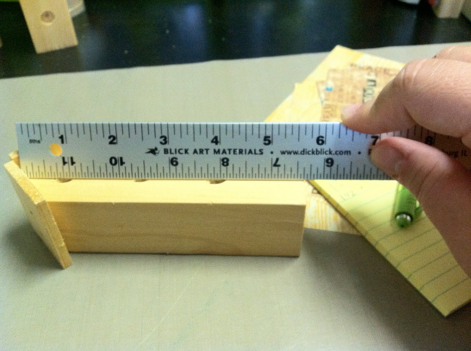
First, I measured each of the birdhouses to determine what size to cut my paper. I cut four pieces at two different lengths for the sides and front/back of the houses.
To get the angle right for the front and back pieces, I lined up a paper strip on the back of the birdhouse and with my thumbnail made a crease where the roof meets the house and trimmed the angles with my paper trimmer. I did this with both longer pieces for the front and the back.
To get the holes in the right place on the front of the birdhouse I put my paper in place and using a stylus I rubbed the outline of the circles. I then snipped them open with a scissor.
To give the corners and holes on the front of the houses a more finished look, I inked the paper pieces and the birdhouse itself with ColorBox fluid chalk ink in my favorite brown, Chestnut Roan.


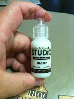
Once my pieces were inked, I was ready to put it all together. My favorite adhesive for projects like this is matte multi-medium from Claudine Hellmuth Studio (Ranger). It doesn't saturate the paper but creates a nice, firm bond.
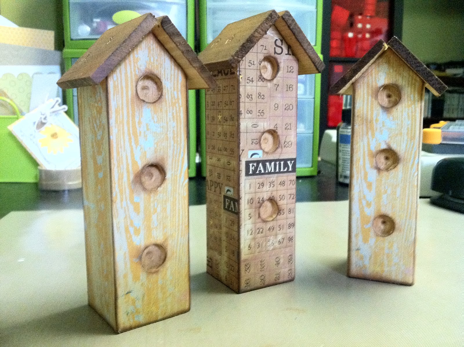
I repeated these steps for all three houses, and here's the result. They're pretty cool on their own, but where's the fun in creating something if you can't also embellish it?
I took another sheet from the 6x6 paper pad in a complementary color scheme and cut several rolled roses using dies from My Favorite Things (MFT). Using an additional paper from the 6x6 pad, I also cut leaves for the flowers using MFT dies.
After assembling the flowers, I added Kaisercraft pearls to the centers. I then arranged the flowers on the birdhouses and added leaves using 3M dimensional foam adhesive.
I added some word sticker sentiments, button twine from Papertrey Ink (PTI), and a hand stamped robin (image from PTI Iconic Images stamp set stamped on the yellow woodgrain paper from Authentique) to complete my project.
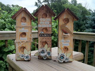
The robin's nest was made using PTI button twine I just wound and tied together. I adhered it in the hole using a glue dot and added three more pearls for eggs.
Here's a close up view of the flowers. After rolling each flower, I adhered the rose with a glue dot and then scrunched and folded the petals with my fingers to open them up and make them look a bit more realistic.
And there you have it. 3 wooden birdhouses, one line of paper, 4 hours of work, and a sprinkling of embellishments and I have a sweet display for my mantle.

Thanks for stopping by, and I hope you enjoyed my project from start to finish!

Supplies:
Patterned paper, word stickers: Authentique Paper
Stamped Image: Papertrey Ink
Twine: Papertrey Ink
Dies: My Favorite Things
Ink: ColorBox
Adhesive: Ranger (multi-medium), 3M (foam adhesive), Glue Dots
Pearls: Kaisercraft
Wood Birdhouses: Jo-Ann Fabrics and Crafts

Friday, July 29, 2011

Authentique and Pink Persimmon: Paper Pieced Card


Here's a little ditty I put together recently while crafting with some friends. My LSS was one of the first to get in the new Authentique paper lines and I picked up a couple of 6x6 paper pads. The beautiful floral print was perfect for paper piecing the dress on this image from Pink Persimmon. I picked up a couple of their stamp sets recently, and I really love this one!

I stamped the image on Papertrey Ink Stampers Select white cardstock and colored with Copic markers. I then stamped just the dress part of the image using selective inking on the Authentique patterned paper. I trimmed this with my Tonic scissors and an X-acto knife and layered it on the colored image, which I had trimmed out as well. I layered another Authentique patterned paper onto my card base and freehand cut the sentiment banner. Put it all together, and you have a super fun card!

Thanks for stopping by, I hope you enjoyed your visit!


Supplies:

Cardstock: Papertrey Ink (Stampers Select White, Spring Rain

Patterned Paper: Authentique (Splendid 6x6 paper pad)

Stamps: Pink Persimmon (Hello, Vintage Girl) and Lawn Fawn (Just My Type)

Ink: Tsukineko (Memento Tuxedo Black)

Markers: Copic

Wednesday, July 27, 2011

Make It Monday: Coloring with White Ink

This week's Make It Monday technique is coloring with white ink. Heather Nichols from the PTI design team put together a great project for us this week which you can find HERE.

I've been enjoying the new Sweet As Can Be set from their July release, so I broke it out again today. I stamped a double dip ice cream cone on kraft cardstock and used Fresh Snow ink on a bullet point fantastix to color in the ice cream. I fussy cut the cone out and added it to my card. The card base is Harvest Gold cardstock matted with nice, summery patterned paper from
Echo Park's Summer Days 6x6 paper pad. I tied a triple bow ribbon with Hug Snug seam binding and scrunched it with wet fingers until I liked how it looked and added a double stack of buttons with button twine tied in a bow. The cone is adhered with foam tape to give extra dimension. What I really love is that the sentiments in this set allow you to highlight the word "sweet" in a different color if you like, so that's what I did. I tried to take a cue from Nichole Heady in planning my colors. Those of you who were in Summer Card Camp may remember she tries to follow the rule of 3's with color, and I tried to do the same. :) Thanks for the tip, Nichole!

Supplies:
PTI: Sweet As Can Be stamp set; Harvest Gold and Kraft cardstock; True Black, Dark Chocolate, Fresh Snow, and Raspberry Fizz ink; Raspberry Fizz buttons; button twine
Echo Park: Patterned paper
Hug Snug: Seam binding tape

Thanks for stopping by! If you want to head back to Nichole's blog and see more fab entries for this week, click on the link above!

P.S. Fellow Stamp-A-Faire alumni will recognize the suitcase in my photo - I won a fabulous prize at the reception! Thanks, PTI!

Monday, July 25, 2011

Papertrey Ink July 2011 Blog Hop


It's that time of the month again, time to hop around the internet and see all of the fabulous things people are making with PTI products! This month's inspiration picture can be seen below:
I love the pop of life that the orange curtains in the photo create against the otherwise very serene color scheme, so I chose that element to focus on. I also like the pattern in the quilt and rather than use the Mehndi Medallion which was the first thing to come to mind, I pulled out Delightful Doilies to create my background. I stamped the images using True Black ink on Kraft cardstock randomly. I added the happy birthday sentiment from Inside & Out: Birthday stamped onto Stampers Select White cardstock cut with the Fillable Frames #11 die. I tied on a piece of Orange Zest twill ribbon and added the Prima e. line jewels. Finally, this was matted on a Stampers Select White card base. Super simple, yet classy with that great pop of color.

All supplies from Papertrey Ink unless otherwise noted.

Thanks for stopping by, and enjoy the rest of the hop! You can find the other amazing cards by going to Nichole's blog HERE.

Thursday, July 21, 2011

Summer Card Camp '11: Week 4 and PTI Make It Monday: Dry Brushing

It's already the final week of summer card camp. Where did the time go? On Monday, I got a package from Papertrey Ink with my July order (super amazing fast shipping, WTG PTI!) and so it was only logical that I break out my new stamps to work on this week's color combo. And since a new Make It Monday challenge was up at PTI, why not add that to the mix?

I chose the Hanging Out set and some fun paper from Echo Park. I made a mask for the clouds using a piece of cloud patterned paper. It's hard to see in the picture, but I dry brushed white acrylic paint through the mask. After the clouds dried I added the pen outline to give them more definition. I freehand cut the heart from Stampers Select White cardstock and stamped with Polka Dot Basics II and Jenni Bowlin Stick Candy green ink. The dress and overalls were cut from Echo Park patterned paper and stamped. Sentiment is from Fillable Frames #11. Grass is stamped with Jenni Bowlin Seed Packet green ink. You can kind of tell from the picture, but I only adhered the top of the die cuts to the clotes line and bent them slightly forward to make them feel like they are blowing in the breeze. Can I just say that I adore this stamp set? So fun to play with! Black ink is Tsukineko Memento Tuxedo Black.


All supplies by Papertrey Ink unless otherwise noted.


Thanks for stopping by!


Sunday, July 17, 2011

Make It Monday, Take 2

I've had this card idea in my head since I saw the pocket card MIM video. I finally got it out on paper (at the last minute) and I'm really happy with it. So is Madeline, who has claimed it as her own. :) The first thing I thought of for pockets was how it would be very fun to do for kids, making the card into a gift itself. And I loved the idea of crayons, because the colors would make a bright, fun focal point for the card.

Not only did I make a pocket on the outside of the card for the crayons, but I also made a pocket on the inside to hold coloring pages that I stamped on 3.5 x 5 cards. The inside can be finished off with a sentiment appropriate to the occasion.


Paper: PTI Stamper's Select White cardstock, PTI Distressed Dot patterned paper, Echo Park Paper Co. patterned paper.
Ink: Tsukineko Memento Tuxedo Black
Stamps: PTI Out of This World, Happy Trails, Fillable Frames Additions
Ribbon: American Crafts
Dies/Punches: Fiskars Threading Water border punch, PTI Fillable Frames #3 die
Buttons: PTI red and yellow, blue unknown.

Thursday, July 14, 2011

Summer Card Camp '11: Week 3

I'm very happy to say that I'm 3 for 3 so far for Summer Card Camp! I'm very good at signing up for online classes but not so good at following through with doing the "homework". So having a 100% participation "score" makes me smile!

My card for this week is inspired by this week's Make It Monday challenge at Papertrey Ink. You can find more information HERE.

I pulled out some cardstock that I felt matched the color combination this week. Then I saw the pad of Tim Holtz kraft glassine that I had sitting on my desk. I've been wanting to find a way to use it on a project but hadn't taken the leap yet, so I got out one of my bloom builder sets and die cut the small and medium sizes. After assembling the flowers I nested them together and added the Pure Poppy button to the center. I wanted the flower to take center stage on the card, so I kept the rest of the design very simple. I created my pocket using Pure Poppy cardstock and Edgers #1 die set. I then took a scrap of kraft cardstock and cut the accent piece to add to the pocket. I used Scor-Tape to close the sides and die cut a piece of Rustic Cream cardstock for the tag in the pocket. I added some twine, a couple tiny buttons on the tag tie, a sentiment from the Wildflower Garden stamp set, and some Kaisercraft pearls. The card base is Dark Chocolate cardstock, cut to 5 x 5.
I really like how the kraft glassine worked for the flower. It's got a dull sheen to it and adds just enough texture to the card to make it interesting.

All materials from Papertrey Ink unless otherwise noted.

Thanks for stopping by!

Wednesday, July 6, 2011

Summer Card Camp '11: Week 2

It's another week and another color combo for Card Camp with Jennifer & Kristina. I wanted to do something a little different this week so I went rummaging in my embellishment drawer and found an unopened package of Studio Calico wood veneer butterflies. After I discovered there were 5 different sizes of butterflies in there, I went rummaging in my paint drawer and went to work. Add some baker's twine antennae, a sentiment from Papertrey Ink, and a hand drawn frame, and I'm pretty happy with what I came up with!

Supplies: Cardstock (Papertrey Ink), Wood Veneer Butterflies (Studio Calico), Sentiment Stamp (Papertrey Ink: Think Big Favorites #2), Pen (American Crafts), Baker's Twine (The Twinery, Divine Twine), Paint (Kaisercraft, Claudine Hellmuth Studio Line, Little Davis Designs), Jewels (Heidi Swapp for Advantus)

Thanks for stopping by!

Monday, July 4, 2011

Happy 4th and Make It Monday!

Hello, and Happy Independence Day America! Thanks to the holiday, I am off from work today and happily found time for a little ink play this afternoon.

Not only is it Independence Day, but its Make It Monday at Papertrey Ink. This week's technique is multi color stamping with reinkers, brought to us by the uber talented Betsy Veldman. You can find her video tutorial HERE.

The only reinker I have is Simply Chartreuse and unfortunately it doesn't look all that chartreuse when I squirted some out of the bottle, so I took out my handy dandy Tim Holtz Distress Ink reinkers. I chose Peeled Paint, Dried Marigold, Wild Honey, and Spiced Marmalade (Crushed Olive is in the picture, but I didn't end up using it). I tried to make my stamp pad using fun foam like Betsy demonstrates, but apparently all fun foam is not created equally and mine didn't absorb the reinker at all. So I went to plan B.


Plan B was to use Ranger felt ink pad material that I have in my stash, which is made for making your own custom ink pads. I cut a small piece (it comes in an 8.5 x 11 sheet) and went to work. I chose an image from Wildflower Garden and stamped it with Memento Tuxedo Black on the ink pad material. I then added a dot of Spiced Marmalade onto the center of the flower, and for the petals I mixed Wild Honey and Dried Marigold. I inked the stem with Peeled Paint. The pad wicked the ink a bit, but it worked splendidly.


I stamped the wild daisy image across the bottom of a 4.5 x 4.75 piece of kraft cardstock. I then took a Fillable Frames #10 die cut out of my scrap tin. It was Stampers Select White, so I took my Wild Honey ink pad and my ink applicator tool and distressed it. I stamped my wildflower one more time on the die cut and added my sentiment. To the center of each flower I added some dots of Ranger black enamel paint. I finished off by adding a band of Orange Zest twill ribbon and a Harvest Gold button stitched on with button twine. I then matted it on a 5 x 5 Ripe Avocado card base.


And there you have it! Thanks for stopping by.

Sunday, July 3, 2011

Double Duty Card: Summer Card Camp '11 and Make It Monday

I think Card Camp was definitely a good thing for me, I'm inspired and making time for creativity again. Pair camp with Make It Monday challenges at Papertrey Ink, and you've got inspiration overload!

Here's another card that I made that uses the color combo from Card Camp and the reverse polaroid technique from Make It Monday. I masked off the center of my Stampers Select White card base and used the same 4 Twinkling H2O colors from my first Camp card to create the frame. This time, however, I watercolored the whole thing first with the light teal color and then went over it with the pink, purple, and orange colors. After it had a chance to dry, I took my Spring Rain PTI ink spot and colored the center with direct to paper inking. I like how swirling the ink on the paper helped leave light spots for a cloudy effect. I then stamped the paper airplane, trail, and sentiment with Memento Tuxedo Black ink. Just a sweet, simple card.

I can't wait to see what the week 2 color combo will be - I hope I find it as inspiring as the first!

Saturday, July 2, 2011

Fabulously Inky Friday Night

Yesterday after work I headed over to my friend Jenny's house for an evening of fun and crafts. I brought along some of my newest stamp sets from Papertrey Ink to play with and managed to get several cards done.

This first card is my favorite. I used Mehndi Medallion and sentiment from Gracious Vases. I stamped with Memento Tuxedo Black and Jenni Bowlin Cough Syrup (red) inks on kraft cardstock. I think it looks just perfect on the PTI Smokey Shadow card base.

For this card I used the 2010 Anniversary set, Botanical Silhouettes. I used Jenni Bowlin Cough Syrup for the flowers and Candy Stick (green) for the foliage, and PTI Summer Sunrise for the flower centers. Pure Poppy and Lemon Tart cardstock, and some Hero Arts gems finished this one off.

I made this card using the "reverse Polaroid" technique shown by Nichole Heady in this week's Make It Monday video tutorial. I masked off an off center rectangle on kraft cardstock and first used PTI Vintage Cream ink to make the first layer of color for the "frame" and then went over it with my finger which I dipped in Tim Holtz Brushed Corduroy Distress Ink. I stamped the zebra from Its a Jungle Out There using PTI Fresh Snow and Memento Tuxedo Black inks. The sentiment is stamped with PTI Dark Chocolate ink. My card base is Smokey Shadow cardstock, matted with a rectangle of Dotty Biscotti patterned paper. I wrapped button twine along the folded side, and added some e. line pearls to the focal point piece. I'm really happy with how this one turned out.
And speaking of Make It Monday techniques, I really wanted to try this one the week it went up but just didn't find the time. So, I got out the UTEE and tried my hand at faux cracked glass. I used the new Daydreamer stamp set on kraft cardstock and added 3 layers of UTEE. After a while in the freezer, I cracked it and rubbed Brushed Corduroy Distress Ink into the cracks. I used two colors of Distressed Dots patterned paper on a background of Scarlet Jewel cardstock, and again wrapped on some of my beloved button twine. I added two stacked wood buttons that Jenny gave me to finish it off.
And this clean and simple card showcases Gracious Vases. I stamped the dotted lines from Mat Stack 1 Collection as a "ledge" for the vases to sit on. I then added a trio of vases stamped in Terracotta Tile and Summer Sunrise PTI inks with flowers and stems stamped in Orange Zest, Ripe Avocado, and Dark Chocolate. Add the sentiment in True Black and Dark Chocolate and three e. line pearls in graduated sizes and voila!

I also made a couple of other cards, which you can see in my Summer Card Camp '11: Week 1 post below. Thanks for stopping by!